How I worked
I was the lead UX designer, reporting to the global head of e-commerce. I led an internal UX team and a creative agency, and worked every day with product owners, developers, the CRO team and the business.
Reports to

Leads
- Senior UX designer, freelance
- Senior UI designer, freelance
- 2 UX/UI designer interns
- Project manager
- 2 UX designers
- UX researcher
Works with & delivers to
Below are two of the projects I led there.
Case study 1
Fit selector
How might we increase conversions and reduce returns by helping shoppers select the right fit on the product listing page?
The process
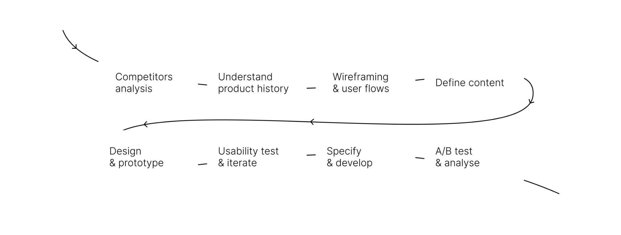
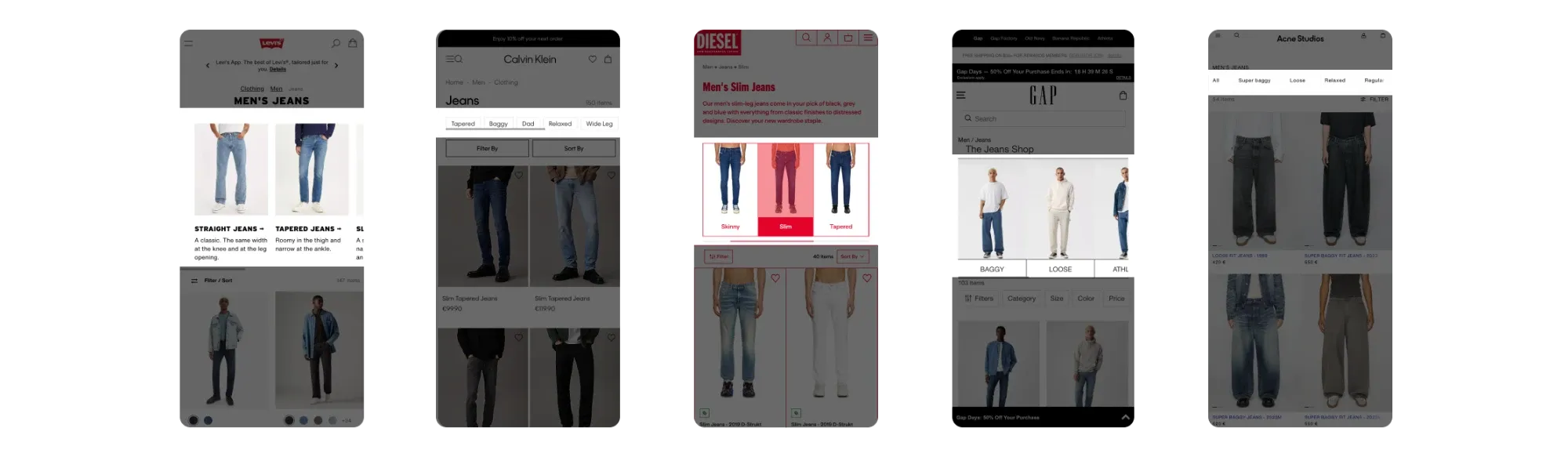
Competitor analysis
I benchmarked 25 competitors. From all the product listing pages I reviewed, none featured a traditional banner (a large image with text).
Product history
When I proposed a visual fit selector to replace the banner, the product owners told me they had already tried one: a fit selector with jeans images, in 2021. It had failed its A/B test.
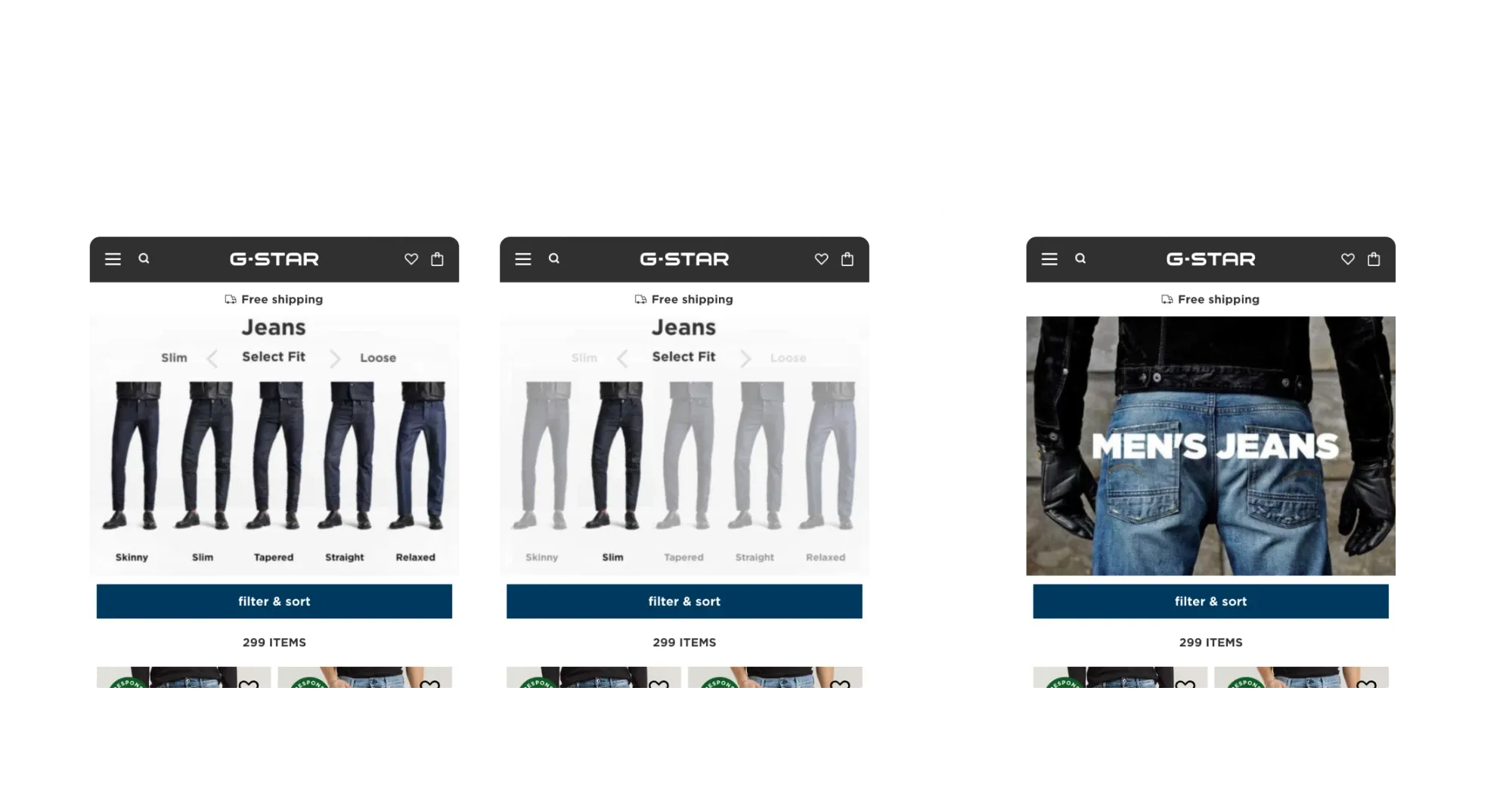
2021 A/B test: the fit selector (left and centre) against the classic banner (right). The banner won: average order value increased by 1.9%.
In my view, the 2021 test failed because of the design, the interaction and the content, not the idea:
- The jeans in the selector looked too similar to each other.
- Once a fit was selected, the other options looked disabled, so shoppers had to go back instead of browsing from one fit to another.
- Nobody had checked whether shoppers understood the fit names (tapered, straight, relaxed…).
Wireframes and main interaction
I explored two ways for the selector to work with the filters.
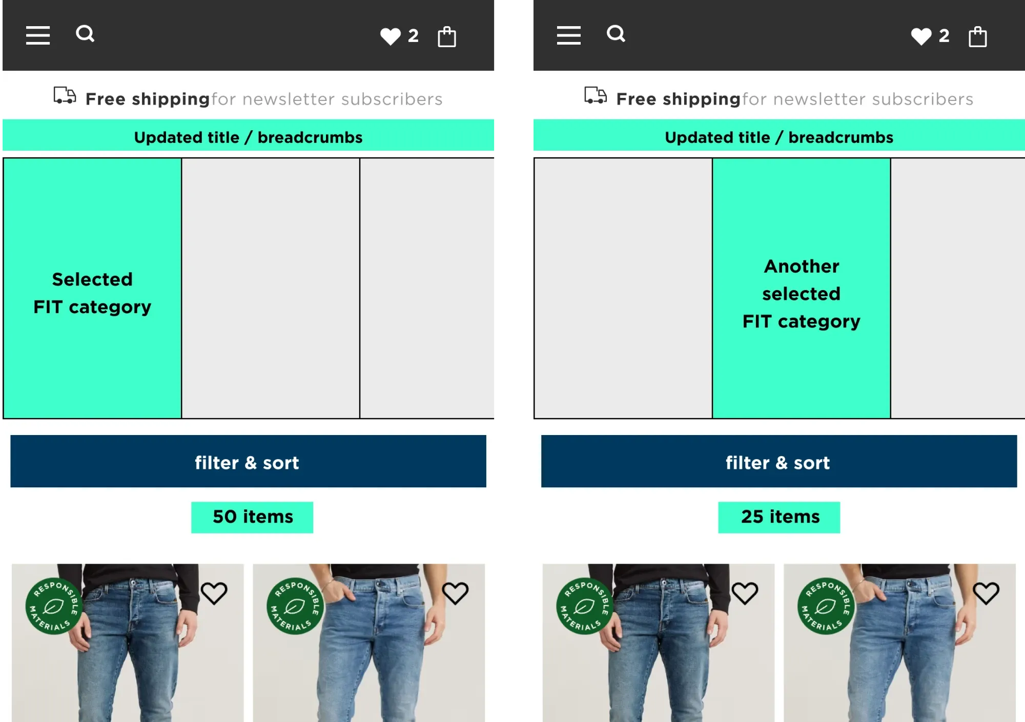
Concept 1 · Select a fit, then another fit
Concept 1
When a user selects a fit, they are redirected to a dedicated subpage of the jeans listing page. This allows them to apply additional filters on top of the selected fit.
Concept 2
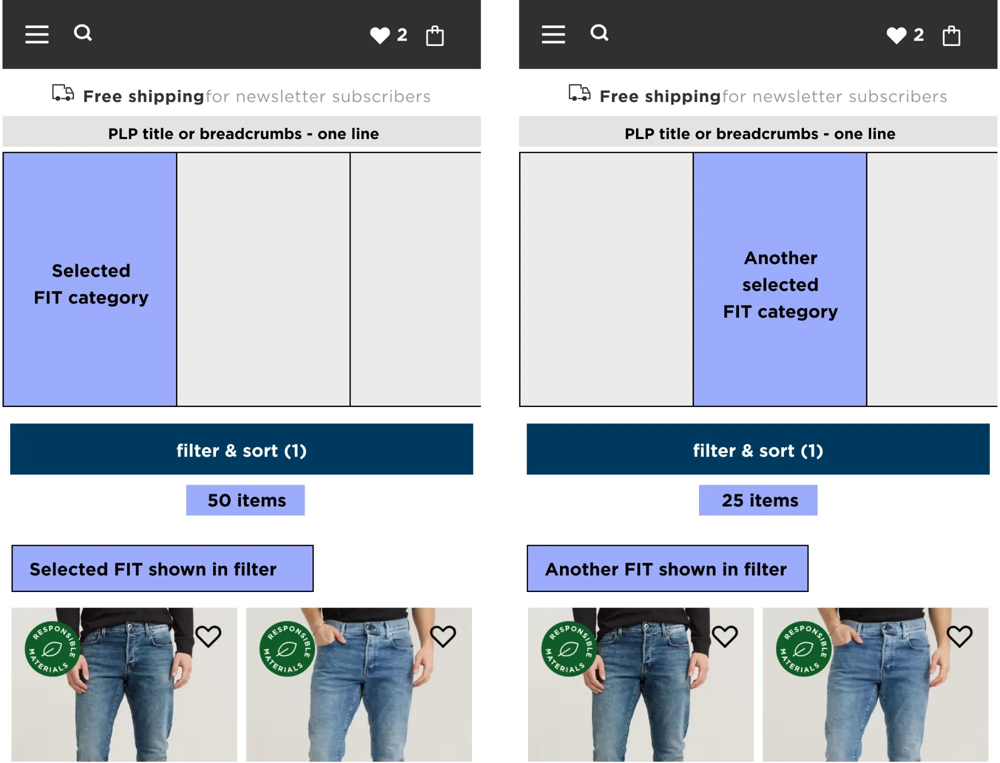
When a user selects a fit, the corresponding fit filter is automatically applied. They can then add other filters, which combine as: fit AND [filter] OR [filter].
In this concept, selecting a new fit automatically deselects the previously chosen one.
Concept 2 · Select a fit, then another fit
First user test
- Goals
- Validate the design concept
- Observe user flows and interactions
- Gather feedback on copy
- Gather feedback on imagery
- Set-up
- UserTesting.com
- 15 participants
- US
- Men, 20 to 35
- Household income $50k to $100k
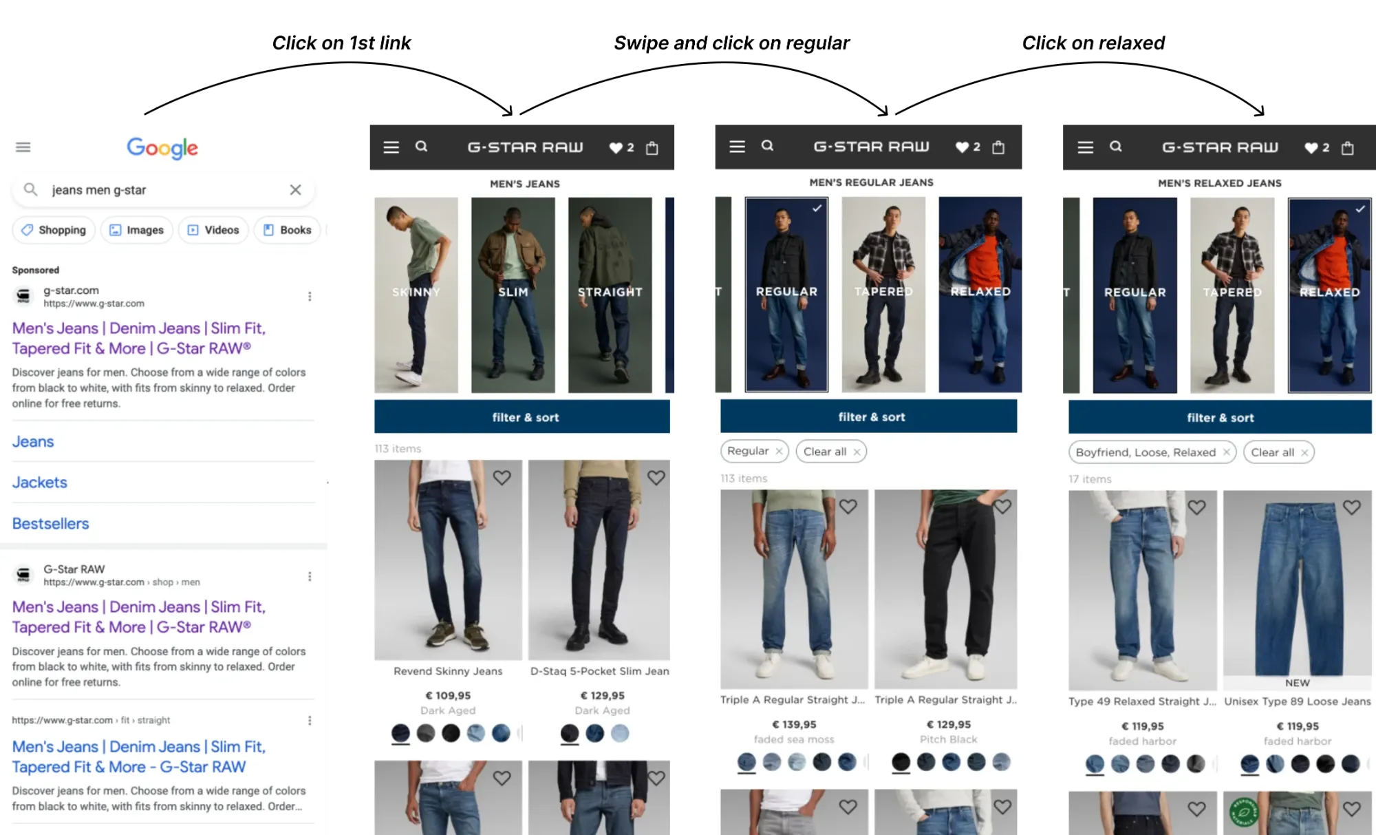
The tested flow: a participant searches for jeans on Google, lands on the jeans page, and switches between fits.
What participants said
- “I like the overall idea of the fit slider and the case use for it.”
- “The fit slider was exactly what I would want to see when shopping for jeans.”
- “Really enjoyed having that at the top as it was the first thing I saw.”
- “I liked it because I almost clicked on the filter button but the slider was right there above it and my eyes went right to it.”
- “It’s not clear to me the difference between regular and straight and tapered and regular.”
- “Some of the terms are subjective, so providing descriptions, to clarify, would be great.”
- “Those [images] with the dark background made it harder to really see the style because the jeans themselves were also a dark color.”
What we found
- Only 53% of users agreed that “the pictures clearly illustrate the different types of jeans”.
- The terms “relaxed”, “tapered” and “regular” were the most confusing.
- Only 7 users noticed that several filters were applied after selecting the “Relaxed” fit.
Actions
Users were confused by terms like straight, regular and relaxed. To understand the impact, I worked with the trade department on sales and returns data. The most returned products, such as “Relaxed Straight”, “Regular Straight” and “Straight”, matched the terms users found most confusing.
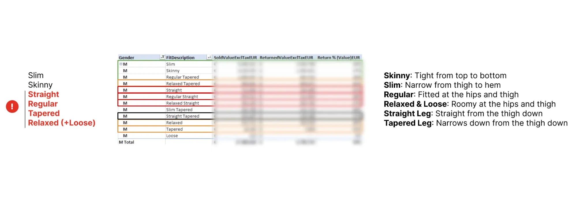
Proposed solution: make it clear that straight and tapered describe the leg finish, and give each fit a short description.
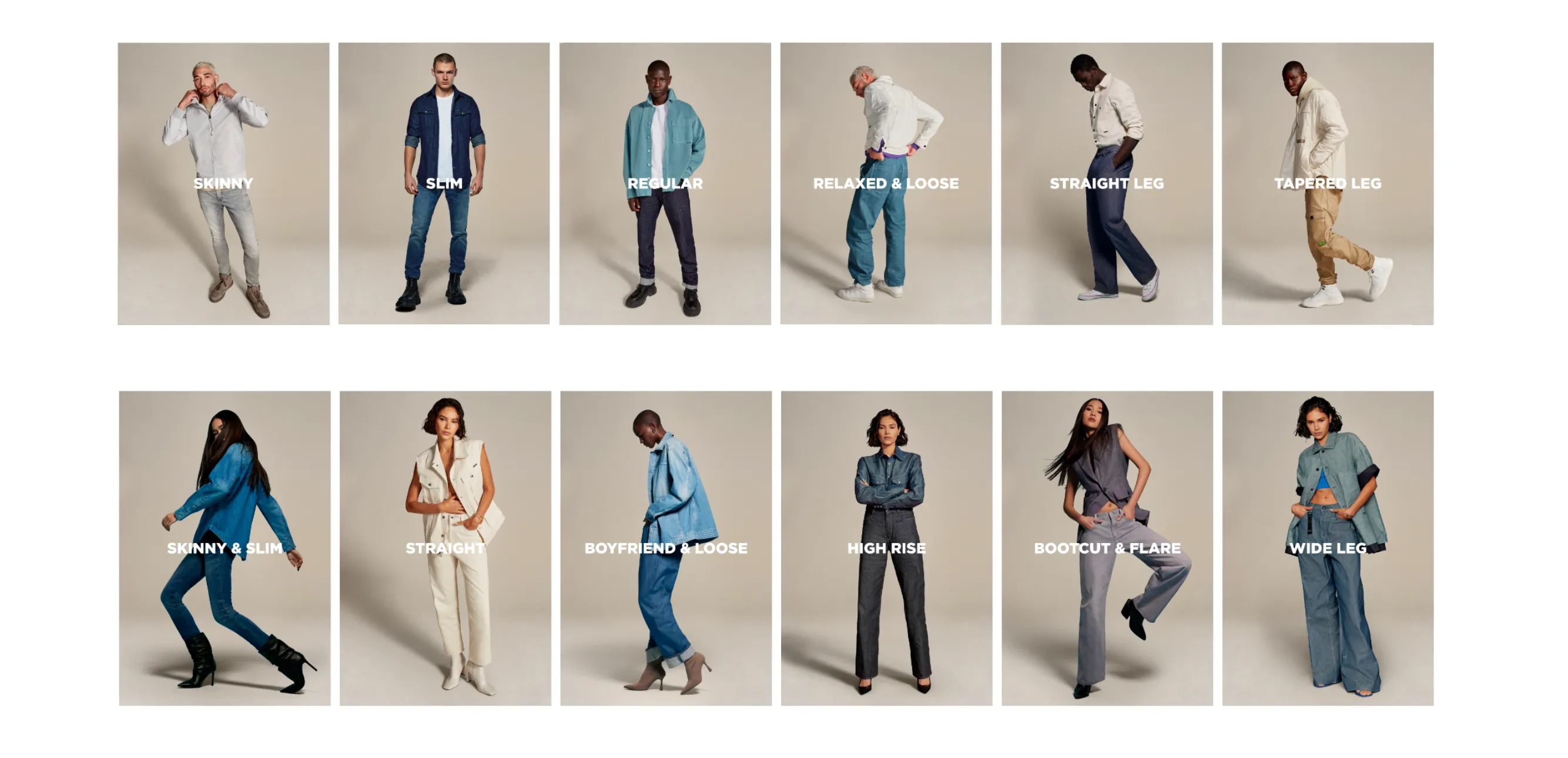
Based on the user feedback, I also asked the content team for new photography, showing the specific fit of each pair of jeans clearly.
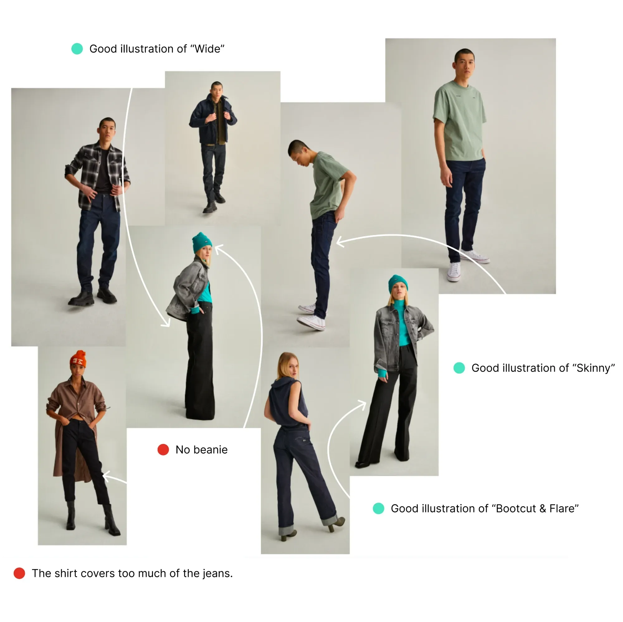
New photoshoot guidance
- Light background (easier to see the product).
- The pose should highlight the particularity of the category (see arrows).
- The entire style should not clearly reflect a season (no winter beanie, winter jacket).
- The focus should be on the jeans (don’t use long accessories).
Final design
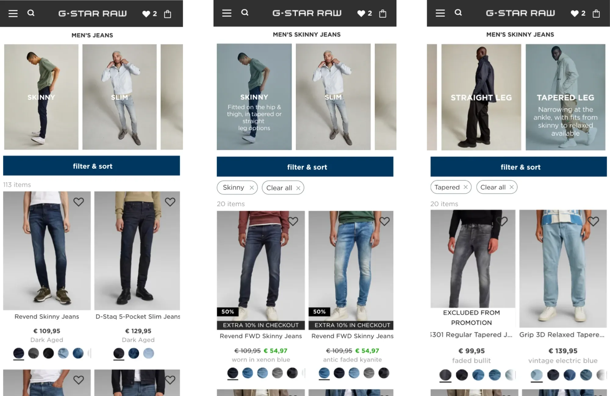
We tested the final design with users again. Here is what they said, in their own words:
The new fit selector replaced the banner at the top of the jeans pages. This time it won its A/B test, with higher conversion, and it has been live ever since.
Case study 2
New product page
How might we improve the product detail page to make products more appealing, strengthen the brand, and drive sales?
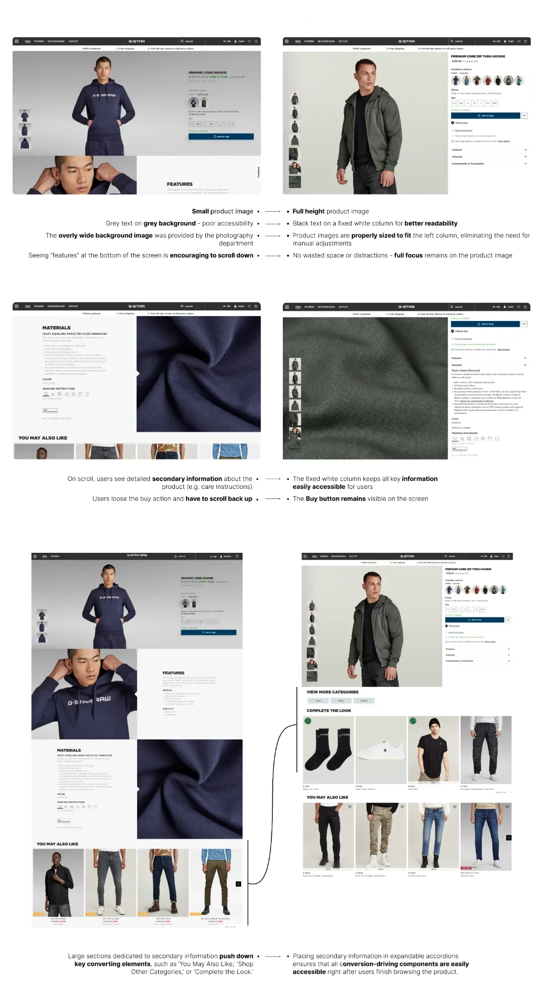
I led the full redesign of the product detail page, putting visual storytelling and the product first. Larger, high-resolution photos show the details of each item, while a fixed information column keeps size, fit, fabric and care information in view as shoppers scroll. The result is both more striking and easier to use.